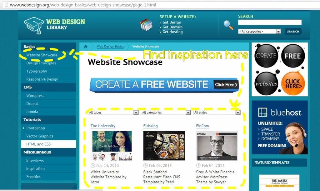
I do not pretend to know a lot about web design. I am writing this from the point of view of a reader. I am always fascinated at how some sites are designed. I have minimal requirements in mine. I am happy that my web designer understood what I wanted. However, those who wish to design their websites on their own can look into webdesign.org for information on how to develop a website.
Here are three tips on how you can make the most of the information shared at webdesign.org:
1. Be inspired by other website designs. This resource is easy to navigate. On the left sidebar, one can see the link to website. Check out existing websites. You’ll find something you like and be inspired to do the same on your website. Try create your own style so that your website will not be a second-rate copy of another site.
2. Learn some cool skills. Learning how to edit photos and graphics is a valuable skill for website owners. Visitors to the site are primarily attracted to the visuals. This means that images should be able to complement the text. You do not need mad Photoshop skills. You can learn the basic at the start and eventually learn more complicated techniques.
3. Check the freebies. Free does not always mean cheap. Good design s not necessarily expensive. Check out their curated freebies and choose which ones can improve your site. There are free icons, patterns and backgrounds that can improve the overall look of your website.
I hope you find these tips useful when you design your own website.
To further enhance your web design plan, here are 3 trends in web design which you can also learn from webdesign.org:
1. Typography. Beautiful fonts can really improve the overall look of the website. The key is to choose a simple one on the text-heavy portion of the website. Make sure the fonts are readable by choosing the right font size. Avoid ornate fonts for text-heavy content. Instead, use these types of fonts for titles and other texts that need emphasis. The quote below is created by combining different fonts.
2. Mobile responsive design. Different devices can now be used to access the Internet. With the millions of users of mobile devices, it is only logical to design a mobile responsive website. This means that whatever may be the size of the screen of the device used to access the Internet, it will not affect the design of the website.
3. Good content. Content is still what drives readers to the website. It is important that a website can add value to the reader. In this information age, good ideas matter. It is what makes people stay on the website longer. It is what makes people check the site again. An engaging content entertains and tickles the mind of the reader.
There are a lot more ways to create a good website. It is a continuous evolution and web designers are always keen in keeping up with the trends. Not all trends can be applicable to the website so it is important to develop some core design principles to follow.


This post is so helpful. I am planning to study or learn web designing in the near future. For now, I am designing our blogs. I’m exploring techniques and other tools for web designing and I will check out this site. Thanks for the tips sis.